You’ve been in this meeting. Six people, one screen share, and a slide titled “Proposed flow” with five grey boxes and some arrows. Someone says, “So the user taps here and then it just kind of expands?” Everyone nods. Nobody has the same picture in their head.
Forty minutes later the decision is “let’s align offline.” Two weeks after that, someone builds the thing, and the first real reaction is a quiet “oh, that’s not what I meant.”
That’s the whole tragedy. Not that people disagreed, but that they agreed with five different imaginary products.
Why we keep doing it
Slides are cheap to make and easy to defend. A box labelled “Confirmation” can’t be wrong, because it doesn’t commit to anything. A prototype can be wrong in public, in seconds, with a person’s thumb on it. That’s exactly why it’s better, and exactly why it feels risky.
There’s also a quiet status game. Talking about an interface sounds senior. Showing a rough one that you’re willing to be corrected on sounds like work-in-progress. I’d argue it’s the other way round.
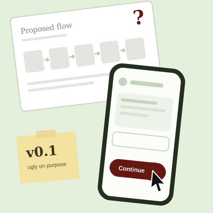
A prototype is a question you can hold
This is the line I come back to. A slide describes an answer. A prototype asks a question, and it asks it of whoever is holding it, so the reaction comes back as behaviour: where the thumb hesitates, what they read first, what they ignore, what they say out loud when they think they’re alone with it.
It also changes who gets to contribute. In a slide discussion, the most articulate person wins. With something clickable in the room, the person who was quiet for forty minutes says, “wait, where’s the back button?” and the meeting is suddenly useful.
My rule of thumb
If we’ve been debating one screen for more than fifteen minutes, we’ve already spent more than a rough version would have cost. So I stop, and I build the ugly one.
- It’s allowed to be ugly. Grey boxes, real words. The point is the interaction, not the polish.
- It has real content in it. “Lorem ipsum” hides the problems. A real name, a real error message and a real long address show them.
- It’s built to be thrown away. The moment people start protecting it, it has stopped being a question.
- It goes in front of someone who wasn’t in the meeting. Fresh eyes are the cheapest research there is.
AI has taken away the last excuse
The usual objection is “we don’t have time to build it.” That objection is weaker every month. AI can get me to a rough clickable draft in a fraction of the time it used to take, and I’m glad to use it for exactly that.
But it only makes the building faster. It doesn’t know which question is worth asking, who should be asked, or whether the reaction means “this is confusing” or “this person is having a bad morning.” That part is still mine. Cheaper prototypes don’t replace judgement, they make it easier to exercise.
When a meeting is the right tool
To be fair to meetings: they’re good for deciding what you’re trying to solve, who it’s for, and what you’ll count as success. They’re bad at deciding what the screen should do. So I keep the first kind and swap the second for something people can touch.
Next time the invite says “alignment on flow”, I’ll ask whether we could bring something to click instead of something to look at. The meeting gets shorter. The decision gets better. And nobody has to say “that’s not what I meant” two weeks later.