The product
DigiLocker gives 550+ million citizens digital access to Aadhaar, PAN, licences and certificates.
A heuristic evaluation of DigiLocker, the document wallet behind identity checks, travel and official transactions in India.
DigiLocker gives 550+ million citizens digital access to Aadhaar, PAN, licences and certificates.
Audited the core document journey against all ten heuristics, rated severity, and redesigned each failure.
Ten findings. Six rated catastrophic, four major. Most trace back to hidden navigation and missing escape routes.
00Approach
When an app is how people prove who they are, a confusing screen is more than an annoyance. I walked the core journey, from home to a document and back, and tested each screen against Nielsen’s ten heuristics.
Each finding has four parts: what I observed, why it fails, a redesign, and a severity rating. Recommendations are grounded in platform guidelines and HCI literature, including Norman, Fitts, Miller and Shneiderman.
01Findings at a glance
| Heuristic | What breaks | Severity |
|---|---|---|
| 1 · System status | Profile photo is the hidden way into navigation | Major |
| 2 · Real-world match | A bottom-nav tab launches an external app | Catastrophic |
| 3 · Control & freedom | An overlay with no way out | Catastrophic |
| 4 · Consistency | Two paths to the same options, laid out differently | Catastrophic |
| 5 · Error prevention | Scroll within scroll, and a misleading icon | Catastrophic |
| 6 · Recognition | Every document has the same icon | Catastrophic |
| 7 · Efficiency | Four taps to reach any document, every time | Major |
| 8 · Minimalist design | Empty placeholder circles take up the screen | Major |
| 9 · Error recovery | “Invalid transaction.” and nothing else | Catastrophic |
| 10 · Help | Help is buried three levels deep | Major |
H1Visibility of system status
Observation
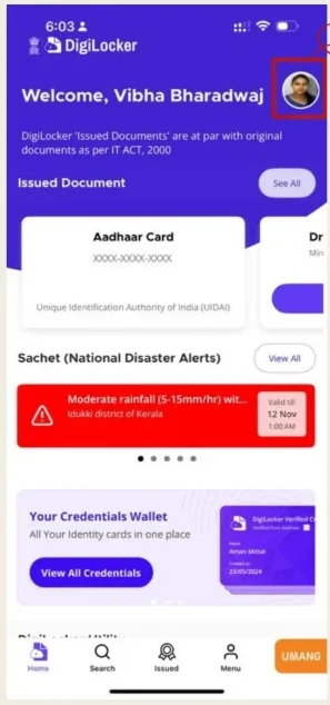
The profile photo looks like a static image. Nothing signals that it opens “My Profile”. Available actions stay hidden, so people can’t form an accurate picture of how the app is organised.
Redesign
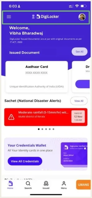
A standard menu icon top-left, a 44×44pt touch target and immediate tap feedback.
Major · Critical navigation hidden without signifiers
H2Match between system and real world
Observation
The bottom navigation holds a “UMANG” button that launches an external application. People expect bottom navigation to move between sections of the same app. This one switches context without warning.
Redesign
Take UMANG out of the bottom bar. Present it on the home screen as a clearly external link.
Catastrophic · Fundamental platform convention violation
H3User control and freedom
Observation
While viewing a document, the icon beside Share opens a “Select Document to view” overlay. It has no close button, no obvious back gesture and no tap-outside-to-dismiss. People who wanted to keep reading are pushed into choosing another document.
Redesign
A prominent close button, tap-outside and swipe-down dismissal, and a bottom sheet that keeps the document visible behind it.
Catastrophic · Users trapped without escape mechanisms
H4Consistency and standards
Observation
The profile photo opens “My Profile” with quick links to My Account, Nominee and Activity. The bottom “Menu” shows the same options in a different layout. Two entry points, overlapping destinations, different presentations.
Redesign
One navigation hub. Remove the duplicate screen and group the menu by meaning, so each function has exactly one primary path.
Catastrophic · Inconsistency prevents reliable mental models
H5Error prevention
Observation
The overlay holds a scrollable list inside a static panel, over a screen that also scrolls. Nothing shows which area will respond. The icon’s place beside Share suggests a related action, so people meaning to share trigger document switching instead.
Redesign
Remove the overlay. Switch documents through a single-level interaction, and keep viewing and navigating visibly separate.
Catastrophic · Ambiguous scroll boundaries create interaction errors
H6Recognition rather than recall
Observation
Aadhaar, PAN and licences all carry the same generic building icon. People must read every label in full, and there is no preview to confirm a choice before opening it.
Redesign
Distinct icons per document type, backed by colour, a long-press preview and thumbnails of the actual document.
Catastrophic · Forces text-reading over visual recognition
H7Flexibility and efficiency of use
Observation
Reaching a document takes four steps: Home, Issued, Select, View. There are no favourites, recents or widgets, so a first-time user and a daily user get the same slow path.
Redesign
A “Quick Access” section on the home screen with pinned and recently opened documents, plus home-screen widgets and app-icon shortcuts.
Major · No efficiency mechanisms for frequent users
H8Aesthetic and minimalist design
Observation
The search screen’s “Most Popular Documents” section shows empty white circles. They could be a loading state, an empty state or a placeholder. They take up scarce space and push real content below the fold.
Redesign
Show the top four to six documents straight away with icons, titles and issuing authorities. Use skeleton screens only while content is truly loading.
Major
H9Help users recognise, diagnose and recover from errors
Observation
The app shows “Invalid transaction.” with no explanation and no next step. People can’t tell whether the network failed, the session expired or the server refused.
Redesign
Name what failed and which document was involved: “Aadhaar Card could not be retrieved from UIDAI servers.” Offer a way to recover, and keep technical detail collapsed for those who need it.
Catastrophic · Complete failure of error communication principles
H10Help and documentation
Observation
Help sits behind Menu, a scroll, then “Need Help”. There is no guidance at the moments people need it, and first-time users get no onboarding. This is hardest on elderly and less tech-literate people.
Redesign
A persistent help button, inline “?” hints beside unfamiliar features, and an optional first-launch walkthrough.
Major
Most of what breaks here is not missing features. It is features people can’t find, can’t leave or can’t trust.
Keep exploring
Two enterprise platforms, rebuilt around the habits expert users already relied on.
2023 – 2025Read case study →
One intent, resolved the same way across voice and chat.
2022 – 2023Read case study →
An offline-first learning platform where the AI supports without ever judging.
2025 – 2026Read case study →