The problem
Two live platforms were failing their most expert users, for opposite reasons.
Two enterprise platforms, rebuilt without ever feeling rebuilt. Both were redesigned around the habits expert users already relied on, not against them.
Two live platforms were failing their most expert users, for opposite reasons.
Ran 41 interviews, then rebuilt both around the sequence experts already worked in: scan, validate, trace.
Both fully replaced their predecessors, and the three-zone structure became a reference pattern for other internal platforms.
00Context
A compliance platform built to prove nothing was missed. An analytics platform built to reveal what mattered. One owner, research through delivery, across both.
Shown here as QA Forge
An AI-assisted software-testing platform: a repository for test cases, scripts and data, with automated execution and reporting.
Used by QA engineers running structured, auditable workflows across web, API, SAP, desktop and database environments.
Shown here as Pulse
An integrated workforce-analytics platform for ingesting, analysing and visualising data across talent dimensions.
Used by HR and talent leaders surfacing insight to drive workforce transformation.
01The problem
Total Testware® replaced a third-party tool QA engineers had operated for years. The brief was to mirror what they knew, then remove the friction underneath it.
OrgAtlas had no predecessor to mirror. It was built from scratch and grown feature by feature, and after two years no structure was keeping pace with what kept getting added.
A · OrgAtlas
Every profile loaded hundreds of unaligned data rows at once, with no signal for where to look first. In compliance work, that ambiguity becomes error.
B · OrgAtlas
Audit trails, logs and profile data sat across 10+ nested tabs. One review meant constant copy-pasting to hold context the system should have held.
C · OrgAtlas
Fields were grouped by backend storage category, not by the auditor’s workflow. Users translated between two logics on every task.
D · Total Testware®
The vendor tool was a flat list: scan for the one that broke. The first redesign nested that list into suites and folders, and buried the one failing case several clicks down.
02The research framework
Interviews with analytics leads, compliance auditors, QA engineers and testing leads, built to watch how people actually worked. Both interfaces had reorganised information in ways that broke the sequence experts relied on.
Move fast across a dense view looking for the one thing that’s off, without the layout hiding it among routine rows.
Pull in the context needed to trust what was just found, without losing the place just scanned from.
Follow the finding back to its source, confident the workspace will still be there on return.
The goal shifted from “make it better” to “make it better without making it feel different.”
| Signal | Decision | Shows up in |
|---|---|---|
| Auditors described their work as a fixed sequence, never as a set of screens. | Keep that sequence as the backbone of the interaction model, not whatever the backend made easy to build. | Persistent Core Anchor |
| Every attempt to “clean up” a dense view read to experts as something being hidden. | Keep the density. Discipline it with a fixed anchor and phase-locked collapse. | Active Operational Canvas |
| The most-repeated complaint was leaving the primary task to look something up. | Every secondary lookup becomes an overlay that returns you to the exact place you left. | Isolated Utility Drawer |
| Users second-guessed menus where every row looked identical. | One rule for every menu: a chevron only where there’s more behind it, a checkmark where there isn’t. | Menu convention |
Withheld: interview transcripts, participant identities and the raw synthesis board.
03The hypothesis
The default instinct on a rebuild is to redesign visibly and show the improvement. The research said the opposite. With expert users, familiarity is the feature that earns trust.
Enterprise users can’t leave a frustrating tool the way consumers can. The platform is the job, so every unlearned habit is a tax paid by the people who already knew what they were doing.
The bet
Preserve the sequence users already worked in, whether it came from a legacy tool or from months inside the product, and refine within it.
The constraint
Every improvement had to feel like a natural extension of the familiar. A tool that feels alien gets rejected, however much better it is.
04The solution
The viewport is divided into three zones, each mapped to a stage in the auditor’s sequence. Tabs were rejected first, because every switch is a navigation decision. A single scroll went next, because experts lost their place returning from a lookup.
Zone 01
Identity the user must never lose stays pinned while the record scrolls beneath it.
Why this matters. It removes the mental reset of losing context mid-task.

Zone 02
Most of the workspace sits collapsed to a status line. Only what’s in progress expands in place, with no layout drift.
Why this matters. Tabs still ask for a navigation decision. Phase-locked collapse removes it.
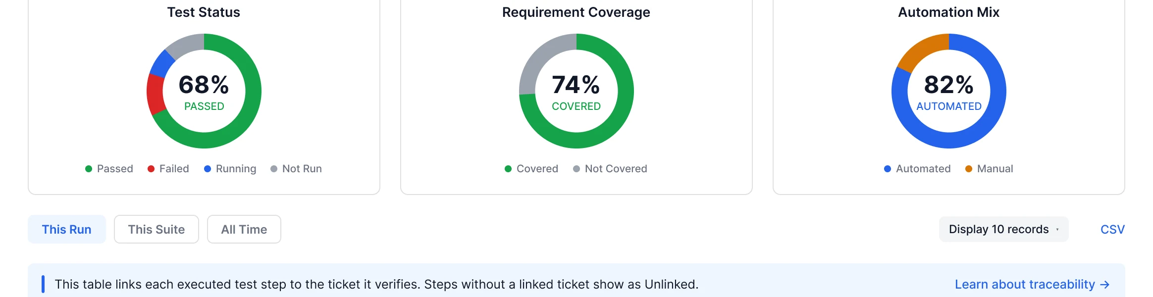
Zone 03
A focused lookup is pulled out of the record entirely. It scrolls independently and closes without losing state.
Why this matters. Deep research no longer derails the primary task.
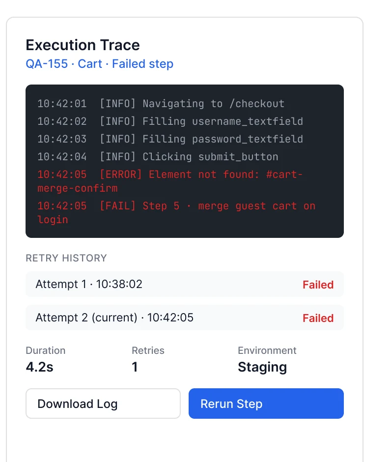
05Total Testware®, redacted
QA engineers think in nested suites, not flat lists. A failing row can be opened, diagnosed, assigned and resolved where it sits. Scroll sideways to walk through it.

Failure triage. Collapsed row, root cause, owner picker, resolved state.
06The platforms
The screens below are the redacted recreations. Hover or focus a screen to pan through it, and select it to open it full size.
07Roles & density
An OrgAtlas admin, analyst and viewer look at the same record for three different jobs. A Total Testware® engineer runs the suite for hours a day; a release manager opens it once a week.
08Edge cases
Every state was designed before a bug report asked for it, including the state where the system itself isn’t sure what the answer is.
Total Testware®
A timing-dependent step is marked Inconclusive, with the reason and a re-run. Treating it as a hard failure trained engineers to stop trusting failures at all.
OrgAtlas
A model’s risk score and a reviewer’s override are both kept, and neither silently wins. The disagreement is the useful part, so it stays visible.
09The system
One token set moved across an HR platform and a QA platform. A one-off stayed a one-off until a second product needed it, then moved into the shared system, versioned.
10Impact
The harder sell was internal, not visual. A redesign built to look almost unchanged is a tough case to make to stakeholders expecting to see the improvement.
Adoption
Both platforms fully replaced their predecessors in production, rolled out to their entire user base. No legacy system was left running in parallel.
Leadership
Leadership backed the approach ahead of any results to point to.
Beyond these two
The three-zone structure became the reference pattern other internal Deloitte platforms were built against.
The strongest version of a rebuild can look almost identical to what it replaced.
Keep exploring
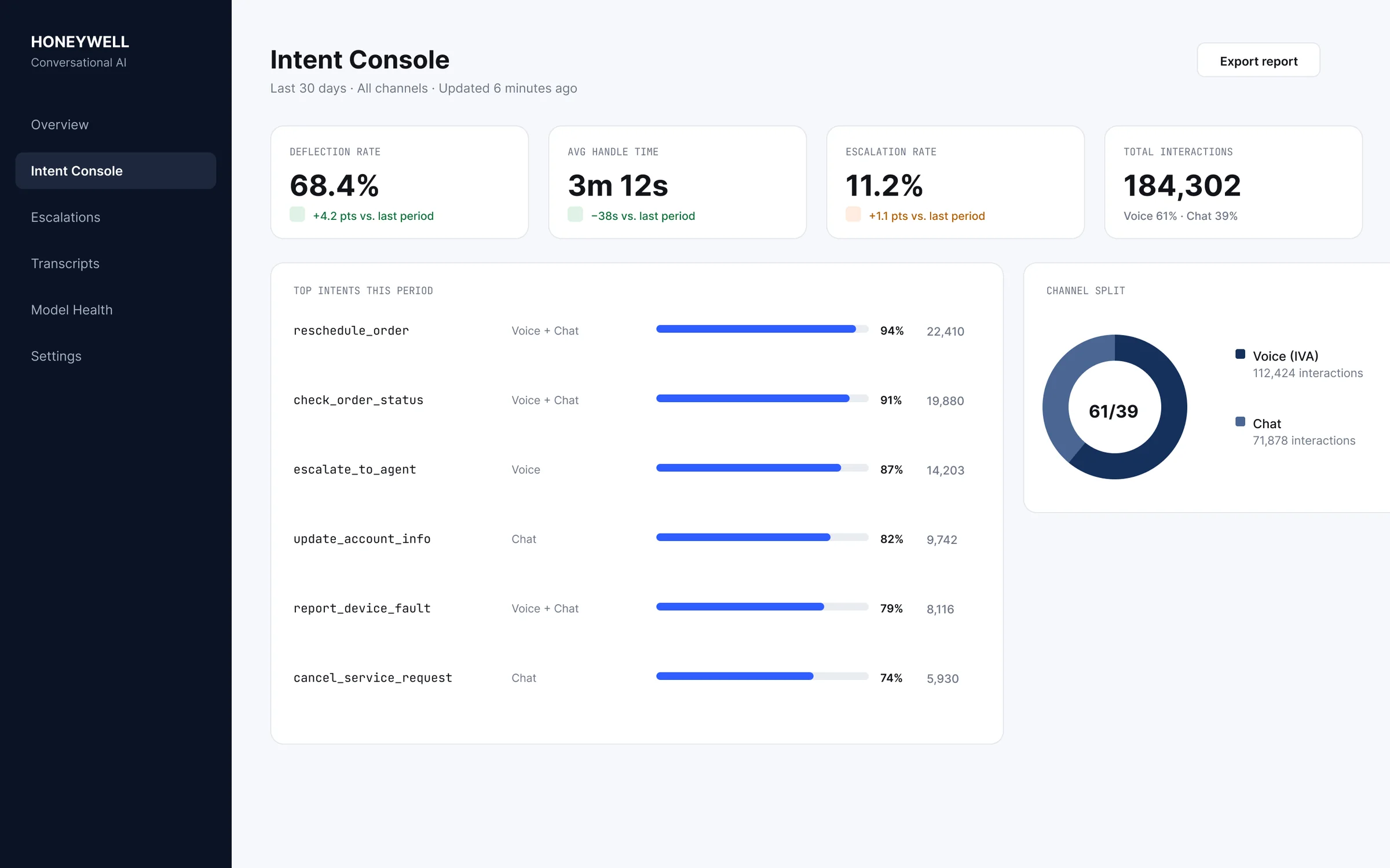
One intent, resolved the same way across voice and chat.
2022 – 2023Read case study →
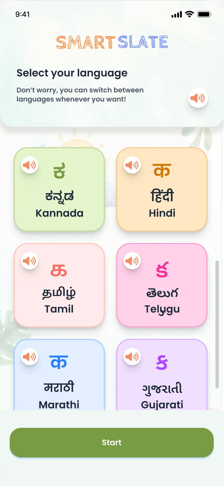
An offline-first learning platform where the AI supports without ever judging.
2025 – 2026Read case study →
A satellite-enabled wearable that keeps vulnerable people reachable when networks fail.
2025 – 2026Read case study →