The problem
Phones and networks fail exactly when safety matters most, and the most vulnerable people are least able to use them.
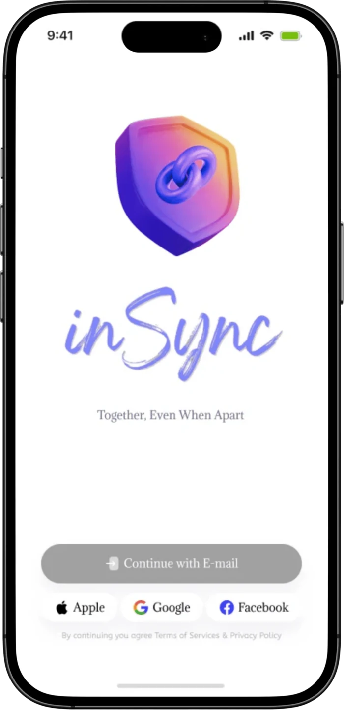
Wearable safety, reinvented. A satellite-enabled, jewellery-like device and companion app that keeps vulnerable people reachable where the mobile network can’t reach.
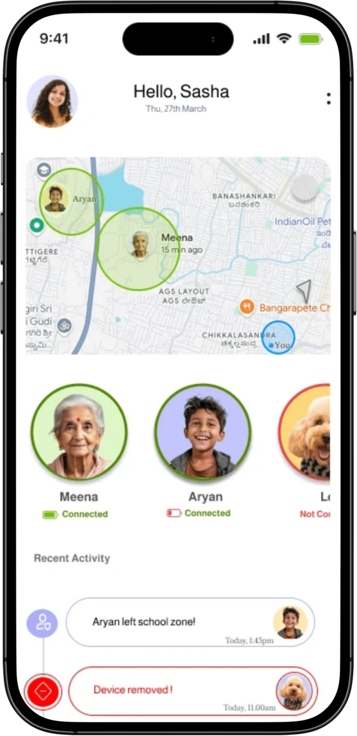
Phones and networks fail exactly when safety matters most, and the most vulnerable people are least able to use them.
Ran a Lean UX loop end to end: research, proto-personas, a prioritised MVP, then a wearable concept and companion app.
Four hypotheses tested with five users. Every task was completed.
01The problem
Smartphones and cellular networks are the backbone of modern safety, and they break exactly when they matter most: in remote areas, disaster zones and the crushing density of mass gatherings.
Children, the elderly, women travelling alone and high-risk workers share the same fear, wandering off and getting lost. Yet every existing solution depends on a phone, a network and a level of tech fluency they often don’t have.
The spark
The Maha Kumbh Mela: 80 million people, stampedes, disappearances, dead networks. Elders in my family wanted to attend; their caregivers were terrified. How do you keep someone safe without taking away their freedom?
The reframe
A Fevicol campaign once sold oversized T-shirts that two people wore together so crowds couldn’t separate them. That low-tech idea unlocked the brief: a persistent digital tether. Proximity and reassurance, without the leash.
02The stakes
Rapid urbanisation, overcrowding and an ageing population are colliding with safety infrastructure that was never built for them. The numbers from the National Crime Records Bureau (2022) are stark.
03Approach
Designing for an emerging technology means designing under deep uncertainty. I structured the work as a Lean UX cycle: surface assumptions, turn them into testable hypotheses, and validate with real users before committing to the build.
Secondary research, NCRB data, technology and market scans to map the real problem space.
Affinity mapping, proto-personas and mental models for children, elders, solo women and workers.
MoSCoW-prioritised MVP, IoT and service blueprints, then lo-fi to hi-fi companion app.
Moderated usability testing, hypothesis scoring and rationale-led refinement.
04What the research surfaced
Four themes recurred across every conversation, and each one quietly ruled out the “just build another tracking app” answer.
Core safety concerns
Wandering off and getting lost is the shared fear across children, elders, pets and pilgrims. Parents fear abduction and road accidents; for elders, medical emergencies top the list.
Usability challenges
Elders forget contacts and struggle with phone interfaces. Children are uncomfortable with wearables and pull them off. Pets need devices that work with any collar or harness.
Limits of today’s tools
Phones are unreliable when it matters. Home systems only work indoors. Maps fail at event-specific infrastructure, and helplines are overwhelmed and slow.
How people cope today
Families pre-decide meeting points, keep a basic backup phone at home, and rely on sheer personal effort to find a missing pet or person.
05Who we design for
Proto-personas built from real safety habits, mobility patterns and communication preferences. Designing for the least tech-fluent user in the room kept every decision honest.
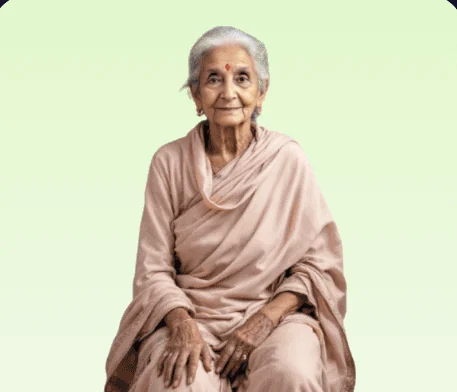
Elderly · early dementia
Independence without the wandering risk. Can’t operate a phone in a crisis.
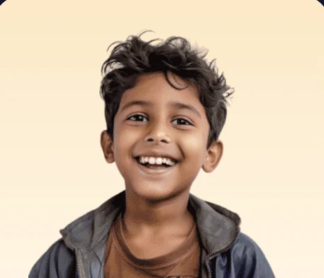
Child · walks to school
Wanders in public; pulls off anything that feels like a “watch”.
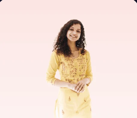
Solo woman · night commute
Wants a discreet, instant way to alert trusted contacts when something’s off.

Field worker · no signal
Works in remote zones where the network simply isn’t there.

Pet · variable collar
Bolts in open areas; the device has to fit any harness and just work.
06Market & competitors
| Competitor | Target | Status | Why it stalled |
|---|---|---|---|
| Safer by Leaf Wearables | Women & elders | Inactive · 2019 | Couldn’t scale beyond a niche; low adoption. |
| Jiobit Tracker | Women only | Inactive · 2020 | Acquired; folded into the Life360 ecosystem. |
| Safe Locket | All users + pets | Inactive · 2023 | Limited features; couldn’t retain users. |
Build the dependable, always-on safety layer that works independently of the mobile network.
07Designing for emerging technology
Satellites, geo-fences and AI motion sensing are invisible to the person wearing them. When the technology is ambient and the user is a frightened elder or a restless child, the design job stops being about screens and becomes about trust, feedback and who sets it up.
On the body
Discreet pendant · LED + vibration
In between
Works with no cellular signal
In the hand
Live location · alerts · check-ins
NTN connectivity reaches remote and underserved areas where cellular towers don’t.
Accurate location data for caregivers, enabling timely intervention.
Dynamic safe zones that flex to context: home, school, an event boundary.
Sensors flag falls and abnormal motion before a button is even pressed.
Real-time, two-way communication between the wearable and the app.
Replace screens with vibration and LED cues, and lean on caregiver-led setup so the wearer never has to “operate” anything.
08The solution
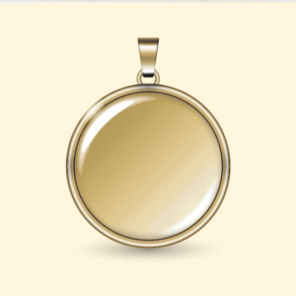
InSync is compact, always-on and deliberately jewellery-like: a discreet pendant for everyday wear across every age and gender.
No screen to learn, no stigma to carry. The intelligence lives in the satellite link and the caregiver’s app.
01
Set virtual boundaries; get an instant alert the moment they’re crossed.
02
One-tap distress signal to caregivers or emergency services. No menus, no typing.
03
Accurate, continuous location powered by GPS and satellite systems.
04
Tracking and SOS keep working even with zero mobile coverage.
05
Talk and listen through built-in audio, or send pre-set voice messages.
06
One platform for children, elders, solo travellers, workers and pets.
09The companion app
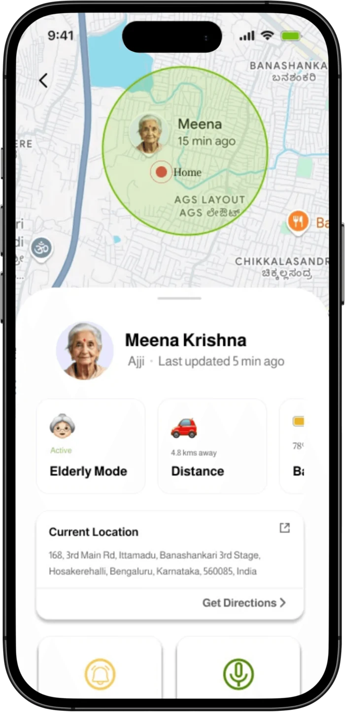
The app is built for the person doing the worrying. Faces over labels, plain-language alerts, and a colour system that reads “safe” or “needs attention” in a fraction of a second.
The wearer never reads a UI. Vibration and LED confirm an SOS sent or a safe zone entered: accessible to a child, an elder with low vision, or anyone in panic.
All configuration lives in the caregiver’s app. The hardest steps are done by the most capable hands.
A single gender-neutral form factor with software modes, instead of separate products that fragment trust and scale.
10Validation
A moderated usability study with five participants put four core flows under realistic scenarios, measured on task success, time on task, error count and assistance required. Every task was completed, and usability scored strongest when a caregiver was in the loop.
| Task | What happened | Result |
|---|---|---|
| Trigger the SOS | 100% success, the fastest task and the standout feature. | Validated |
| Understand GPS tracking | Clear at a glance; faces beat labels. | Validated |
| Respond to a fall alert | Confident responses; plain-language alerts landed. | Validated |
| Complete onboarding | Multi-step navigation ran slower. UI to simplify. | Refine |
Target outcome for the product: reduce time-to-locate during emergencies by up to 70%. This is a goal, not a measured result.
11Reflection & what’s next
People want to feel secure without feeling monitored.
Users responded best to tactile feedback, minimal interfaces and features that worked silently in the background.
Designing for low-tech users meant stepping away from notification-driven patterns toward confidence-building cues.
Remote, mediated testing was hard for low-digital-literacy users: a strong case for in-person onboarding support.
No one should ever feel helpless during a moment of distress, and good design can make sure they don’t.
Keep exploring
A heuristic evaluation of the document wallet used by 550+ million citizens.
10 findingsRead case study →
Two enterprise platforms, rebuilt around the habits expert users already relied on.
2023 – 2025Read case study →