The question
What does an optical condition have in common with a psychological one?
A research-grounded framework for designing with astigmatism and anxiety, held together in one study on purpose.
What does an optical condition have in common with a psychological one?
Nothing clinically. But interfaces make the same mistake with both: they add strain, and strain compounds.
Four behaviours that serve both an eye and a nervous system, and a checklist a design review can use.
00Why pair these
Astigmatism is a shape problem in the eye. Anxiety is a state of heightened threat-perception in the mind. Nothing about their biology overlaps. What overlaps is what a badly made interface does to each.
A screen that’s slightly too low-contrast is fine for a minute and exhausting after twenty. A flow that’s slightly too ambiguous is fine once and corrosive on the tenth repeat. Neither condition announces itself in analytics. Both are more common than most product teams budget for.
Share of population, on one 0–50% axis
Astigmatism · 28–47%. A range across two population studies, by age group and diagnostic threshold.
Anxiety · about 4%. WHO estimate of the global population, 2019.
These are not the same kind of number. One is a refractive measurement, the other a diagnostic estimate. The point is that “the average user” is a fiction: any product with a real user base already has both groups in it.
01Astigmatism · optical strain
The cornea or lens is shaped more like the back of a spoon than a ball. Light bends unevenly across it and never resolves to one sharp point. The result is two images competing for the same spot, at every distance, and an eye that keeps refocusing to compensate.
High-contrast dark mode is often recommended as an accessibility default. For astigmatism, the research is more mixed. Bright text on a very dark background can scatter inside an eye that already bends light unevenly, producing a perceived glow around letterforms.
The glow is a simulated illustration. Halation happens inside the eye, not on the screen. Preferences are mixed even among people with astigmatism, so the response is to make it adjustable and default to a softened version.
WCAG 1.4.3 sets a 4.5:1 minimum for normal text. It’s a floor, not a ceiling, and the ceiling (pure white on pure black, 21:1) is the combination most likely to produce halation.
Below the minimum
Astigmatism means light entering the eye focuses at two points instead of one, so every letterform already arrives slightly doubled.
line-height 1.15 · spacing normalMeets SC 1.4.12
Astigmatism means light entering the eye focuses at two points instead of one, so every letterform already arrives slightly doubled.
line-height ≥1.5 · letter ≥0.12em · word ≥0.16emWCAG 1.4.12 doesn’t mandate loose spacing by default. It requires that a layout keeps working when a reader applies these minimums themselves.
Characters that collide
Il1 O0
In many sans-serifs, capital I, lowercase l and the digit 1 are near-identical strokes.
What to look for
A face such as Atkinson Hyperlegible, from the Braille Institute, adds a tail on the lowercase l, a curved base on the 1 and a narrower 0, so each character stays distinct under blur or doubled focus.
02Anxiety · cognitive strain
The body’s threat-detection system responds to uncertainty the same way whatever the stakes. A missing status, a ticking clock, an action with no visible undo: each is something to keep tracking. One ambiguous moment is nothing. A flow built out of them adds up to vigilance, which never shows up as an error.
| Step | What raises strain | What flattens it |
|---|---|---|
| Find the cancel option | Buried three levels into settings | Listed directly on the account page |
| “Offer expires in 4:59” | Countdown and scarcity messaging | “No rush. You can restart anytime.” |
| “Are you sure?” | No explanation of what’s kept or lost | States what happens to your data and lets you review |
| Processing… | No status label, no time estimate | Labelled progress |
| It’s done (maybe?) | No confirmation | Explicit confirmation and what happens next |
A hypothetical flow, illustrating how small unresolved moments compound. UXmatters calls these “micro-anxieties”.
Working memory comfortably holds roughly seven items. A flat list forces the reader to build their own structure in real time, which is itself a small unresolved task.
Flat · 12 facts
Grouped · 4 chunks
03Synthesis
Both threads converge on one complaint: the interface demands repeated, involuntary effort before the person can get to what they came to do. Every principle below has to earn its place on both sides.
01
A state that’s only implied asks the reader to look again. “Look again” is never free.
Optical. Re-checking is a literal re-focus. Cognitive. An unresolved signal keeps being tracked until it’s closed.
02
Layout that shifts or a step that auto-advances forces a fresh read of a screen already resolved.
Optical. A shift means re-locating and re-focusing. Cognitive. Predictability and familiar conventions.
03
A confirm dialog isn’t a review. A real review shows the consequence and leaves room to change course.
Optical. Reversibility absorbs a misread label. Cognitive. Forgiving, undo-friendly interactions.
04
Text size, spacing and timing are three separate dials, not one bundled “accessibility mode”.
Optical. Room to grow without the layout breaking. Cognitive. No forced countdowns.
04Applied patterns
A speculative account-settings screen, not tied to any real product, showing the principles as actual controls.
05Audit checklist
06Sources
Keep exploring
A heuristic evaluation of the document wallet used by 550+ million citizens.
10 findingsRead case study →
Two enterprise platforms, rebuilt around the habits expert users already relied on.
2023 – 2025Read case study →
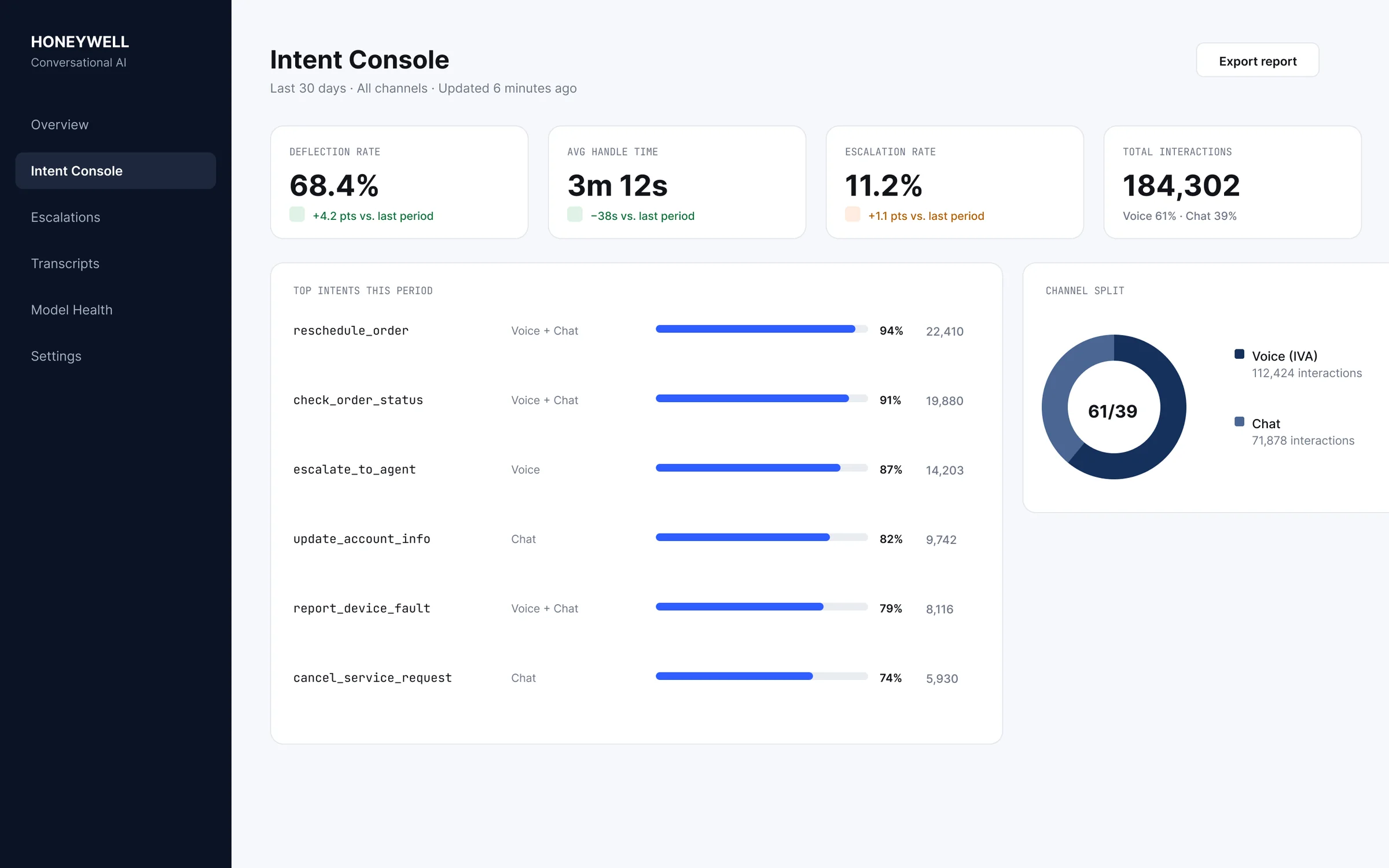
One intent, resolved the same way across voice and chat.
2022 – 2023Read case study →